


Where is the global warming evidence?
I obtained these graphs US Global Change Research Program: 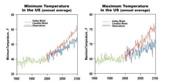 The Green line represents the actual temperature data from the US. The red and blue lines are based on differnet climate change models. I don't know about you, but I recall from math class that trends from graphs are usually based on the existing data. You find the average points on your data line and then extend that trend line outward. In these graphs, the projections seem almost unrelated. In fact, if you drew a line for the actual U.S data, the line would be straight across. The actual data shows wild fluctuations, but on average shows there has been no tempature change in the United States from 1900 to 2000. How can that be?
The Green line represents the actual temperature data from the US. The red and blue lines are based on differnet climate change models. I don't know about you, but I recall from math class that trends from graphs are usually based on the existing data. You find the average points on your data line and then extend that trend line outward. In these graphs, the projections seem almost unrelated. In fact, if you drew a line for the actual U.S data, the line would be straight across. The actual data shows wild fluctuations, but on average shows there has been no tempature change in the United States from 1900 to 2000. How can that be?
posted by Sloanasaurus | 6/02/2006 12:56:00 AM
![]()
![]()
Post a Comment